Art and Painting in Essence:
Qualities, Materials, and Things-to-Know Before You paint that Masterpiece
QUALITY GESTURE
Gesture is the magical skill that makes some art more valuable than other art. Pablo Ruiz Picasso and Jean-Michael Basquiat are the only two 20th century artists who by my measure had PERFECT GESTURE, although some, like Jackson Pollack, were close. This quality separates good art from great, subjective from objective.
SECTION ONE: IDEAS OR SUBJECTS
There are only so many different things you can paint and they fall under one of the following headings:
- Abstract (not necessary to have knowledge of subject at the outset…just brainstorm out an idea. However, the best abstract art that is not ‘high concept’ still follows the rules of making art).
“Sky, Sea, and Sun #1”
“Turn Around”
- People/Portrait (crowd scene, group, person of note, or loved one).
“What Does She Know”
“Mojdah’s Nephew”
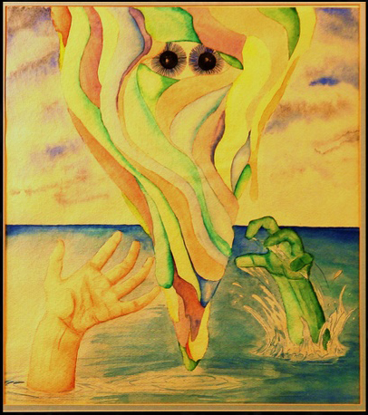
- Fantastical/Surreal (from dreams and imagination).
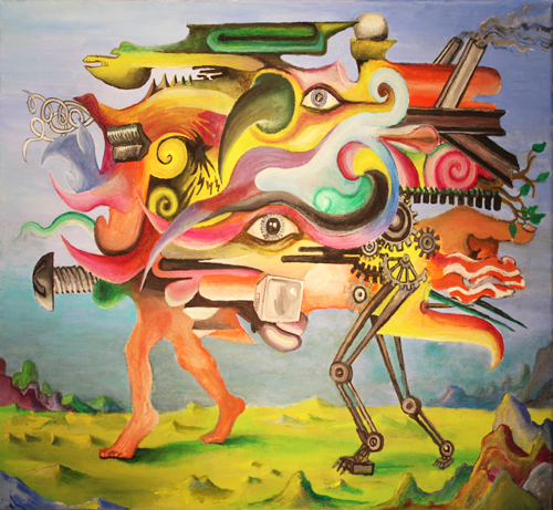
“Unbound”
- Landscape (outdoors: foreground, middle ground, and background, usually with some sky).
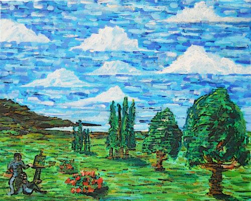
“Artist and Model”
- Still Life/Nature (common objects or plants in a pleasing array).
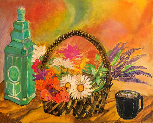
“Study of Fragrance”
- Animals (from anteaters to zebras).
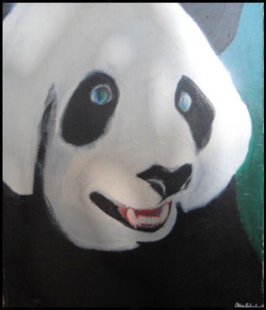
“Endangered Panda”
- Architectural (a kind of landscape categorized separately; utilizes PERSPECTIVE).
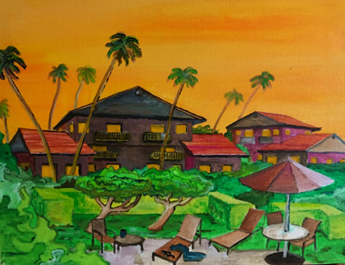
“Kauai Beach Hotel”
SECTION TWO: MATERIALS
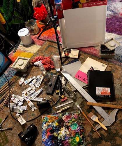
Ideally, you will have: a wide variety of acrylic paints* so you can select the right color every time without having to mix, canvases*, a wide variety of brushes*, water, a plant mister to keep your paint from drying, a palette to hold and mix your canvases on (disposable grey paper palettes are fine, but mine is a sheet of thick glass that I scrape off every so often), towels, paper, pencil, eraser, sharpener, charcoal, ink, straight-edge, compass, various templates, maybe a pallet knife for heavy paint application, texture gels to build up the surface of your picture, a camera to record your finished work, carbon paper (to trace over computer-printed pictures so you can get accurate reproductions—essential, if you don’t draw well), possibly a computer with photoshop for final adjustments, a T-square and a roll of masking tape.
*Price does matter. If you buy crummy paint your colors won’t be as nice (I highly recommend Liquitex acrylic). Cheap canvases aren’t as tight and don’t last as long. Make sure the texture of the canvas you buy isn’t too heavy or too dry. If it is, you will struggle to fill all the cells with paint. With more brushes you have the better effects available to you (but some cheap brushes are just as good as expensive ones, believe it or not). Be smart. If you’re only going to paint once, don’t spend a mint on art supplies.
SECTION THREE: BRUSHES FOR ART:
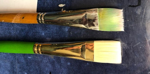
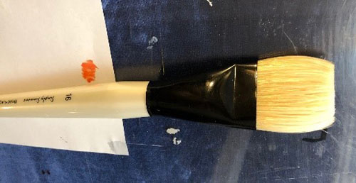
Brush—Flat: Good for edging in a geometric abstraction and making broad strokes in a large area.
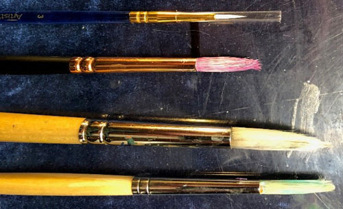
Brush—Round: “01” and “0001” rounds are the best for making details.
Get a Variety 10-pack of nylon ones at Michael’s Crafts along with some larger rounds. This is my favorite kind of brush.
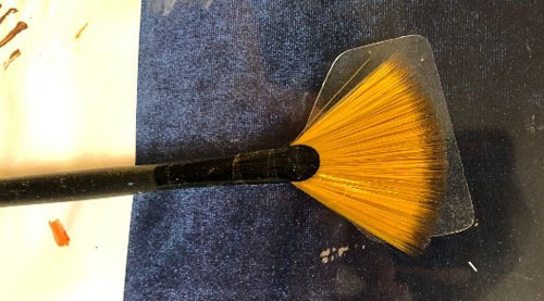
Brush—Fan: Good for making light foliage. Dip the edges of the brush in a dab of paint and daub it onto the canvas for leaves in bushes and trees.
NOTE: don’t daub too much on while using this technique or it will all blend too much and you’ll lose your background.
Brush—Filbert: Not a very useful kind of brush compared to the others.
As far as that goes, an “Edged” brush (a flat that has angled bristles) isn’t as useful as a round, flat, or fan…
SECTION FOUR: THE QUALITIES OF GOOD ART:
All eye-catching, lasting art has the same fundamental qualities. When all of these qualities are taken into account, even an abstract picture looks excellent. Believe it or not, you don’t have to know how to draw well, just use the qualities of good art in your picture and generally speaking, you are successful.
- Composition: Involving the balance and design of “elements of form” in the picture. For example, in a landscape the two locations where the horizon line runs off the edge of the canvas are higher than the horizon at the center of the canvas (see the landscape painting, “Seattle”). Anther compositional device involves off-centering the subject matter and balancing it with extra background space on the opposing areas (see “Icon”). Another possible composition is an all-over effect (see “Heaven on Earth”).
In the painting “Seattle,” you see the “Umbrian Bowl.”
Umbrian painters in the Italian Renaissance discovered that a landscape with high sides and a low center was pleasing to the eye.

“Seattle”
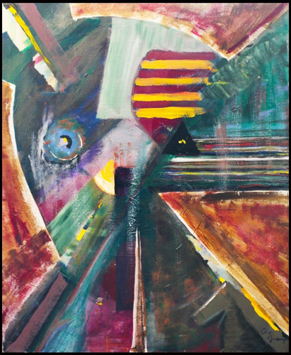
The painting “Icon,” uses a different compositional device: off from center.
The subject (iris, focal point, positive space) is balanced by the “negative space” of the background (colorful diamonds).
“Icon”
“Heaven on Earth,” an all-over effect composition. Note the use of PERSPECTIVE.
The lines of the apartment buildings lead to the image of Mount Rainier in the background, drawing you into the picture and moving your eye around.
Things get smaller as they are farther away… The theory of perspective. Converging lines create a focal-point… A theory of composition.
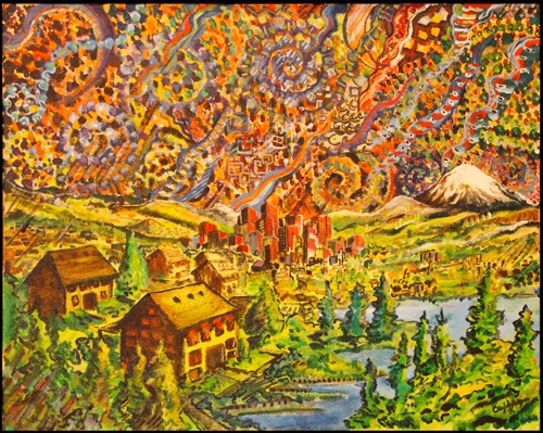
“Heaven on Earth”
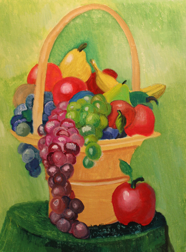
Another possible composition places the subject right in the center (see “Where are the Grapes” and “Buddha” below).
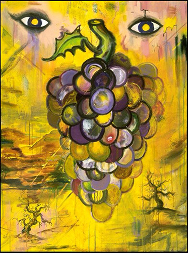
“Where are the Grapes”
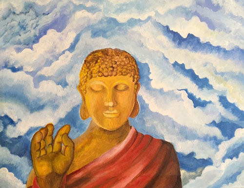
“Buddha”
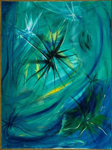
You could also compose the subject around the outside of the canvas as in “Diamond Ring,” and “Spinning Breeze.”
“Diamond Ring”
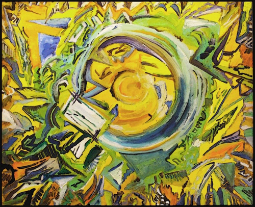
“Spinning Breeze”
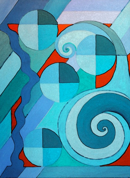
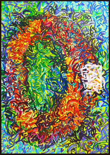
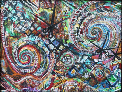
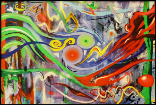
It is also possible to balance space with repeating forms.
Note how the spirals, stripes, two purple eggs, and three “picture frames,” (viewed from the side in perspective) bring unity to this composition, called “The Birth of Life.”
“The Birth of Life”
In “Ripening,” the red apple in the lower right quadrant of the picture offsets the rest of the lighter-colored fruit, as does the deep green of that side of the table:
“Ripening”
Utilize any one of a thousand other effects. Just remember to structure your pictures so they move the eye around the image and stay “in balance.”
- Space: positive space and negative space, what is seen (or not).
Note that in the painting “The Beach at 6 AM” there is interesting negative space around the focal point (the lime green palm trees).
Also notice the interplay of the space created by the bright blue water,
receding beach, and summer sky.
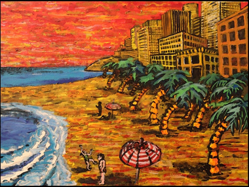
“The Beach at 6 AM”
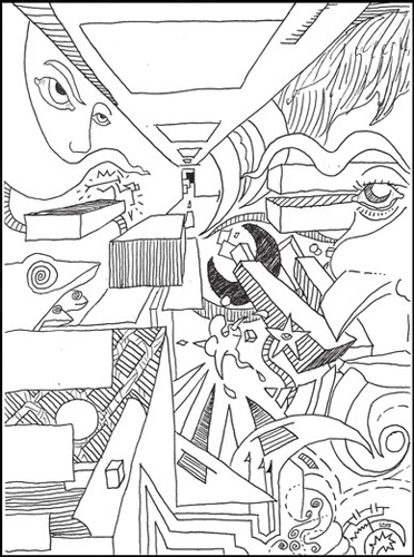
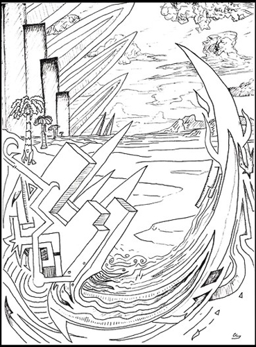
This painting, “Slab Jack” utilizes artificial space and creative perspective with multiple vanishing points to create the illusion of depth and Space.
“Slab Jack”
- Line: Often develops into perspective, necessary for the realistic rendering of three dimensions (space) on a two-dimensional surface (your paper or your canvas). A good painting is normally sketched out with vine charcoal or pencil. Expect to make some mistakes, unless are the new Leonardo. It is okay. There are erasers. You normally want to work from a good sketch before applying the paint.
“The End of the Hall”
“Mojo Rising”
That brings us to the eternal question: What to create?
- Form: What do you wish to render/draw/paint/sketch? How will you bring your subject to life? What do you want it to look like when finished? In the case of most pictures, what are you trying to say?
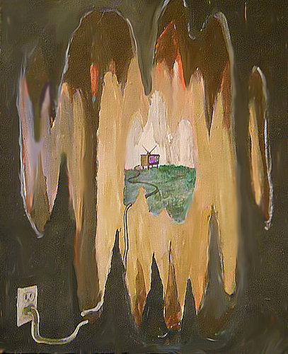
“I want to paint fiery explosion! …In black.”
“Dark Explosion”
You are limited only by your imagination. Art takes many forms. Although I believe there are certain qualities that make real art objective and eternal, most people believe art is subjective (in the eye of the beholder). Make what you want and work on it until you feel you have pushed it as far as you need to.
“The Magpie”
- Shape: Somewhere between composition and form are the shapes that you use to develop your work. The basics here: circle, square, rectangle, triangle, oval, diamond) these are the building blocks of most art.
- Color: (Local color—how it looks in real life; Expressive color—the artist chooses any colors to paint his subject in).
“I want to paint a yellow horse…! And a pink sky!” (Expressive Color)
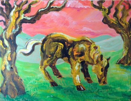
“Horse”
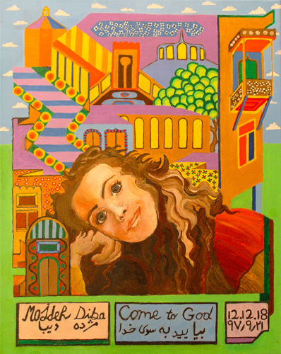
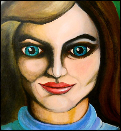
Portrait of my Friend, Mojdah Diba (Face in Local Color; Background in Expressive Color)
More color: There are some color schemes that look great and some that don’t…Don’t paint a red and green painting or it will look like you’re thinking about Christmas. Don’t use cool colors to express hot subjects, as a general rule (Cool colors: blue, green, teal; Warm colors: red, yellow, orange).
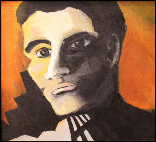
Blue monochromatic color scheme in the painting “Centurion.”
Orange monochromatic color scheme in the painting “Building Bellevue.”
- Unity or Harmony: Repetition with variation, pattern and rhythm, movement, color. Similar handling of materials grants unity as well. Similar lighting effects. Anything that makes the picture feel “one with itself” makes in more harmonious.
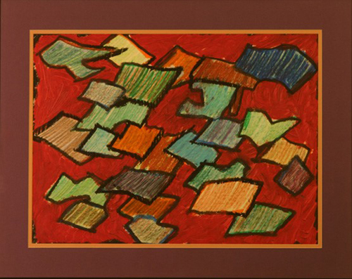
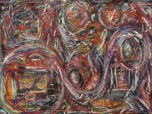
“Documents 2”
In the above picture, Documents 2, the seemingly unrelated shapes in indeterminate space and light are ALL outlined in black; ALL of the crayon layers composing the colors are strokes made from lower left corner to upper right corner; and ALL the shapes are similar size.
- Texture: (surface) Impasto (the layering of thick coats of paint… word from the Italian Renaissance…See Rembrandt), Collage (cutting out elements from Books, Magazines, or other sources and pasting them together, popular with the Dadaists of the 1920’s and the Surrealists of the 1930’s), Assemblage (more three-dimensional than collage), and modelling paste or texture gels (store-bought additives to paint—sometimes like sand or tiny flakes).
Texture, “Man and Woman”
Texture, “Nest Rooms”
- Light and Shadow, VALUE: (shading) Sfumato (Italian Renaissance word meaning “As if lighted through smoke…” See Caravaggio), Highlights (places where most of the light hits the form). à Flip-flop of Light-Dark-Light-Dark make a most interesting picturesß Images that are all of one value are, as you can imagine, less interesting.
“Pensive”
You’ll do better if you remember where the light is coming from
- Blending (transitioning, mixing, gradients): Wet into wet, Layering (glazes), Cross-Hatching, Dry Brushing (hitting the top of the cells on the canvas while leaving the underpainting in the bottom of the cells), Stippling (making many small dots, also called pointillism).
Blending, wet into wet:
“Togetherness”
Layering:
“Good and Evil”
Cross Hatching:
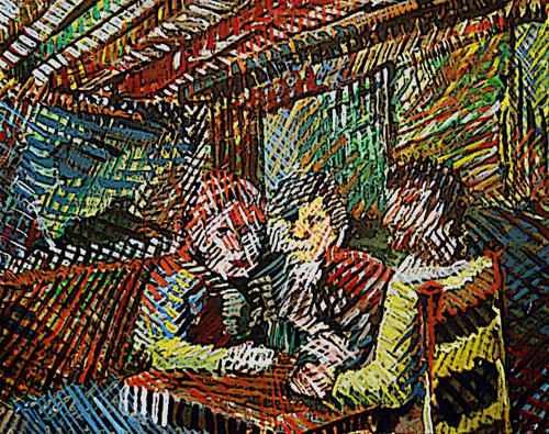
“The Hamburger Club”
Dry Brushing:
“The Spy”
Stippling:
Stippling is used in the background and a bit on the subject (the sunflowers)
in this copy of Vincent Van Gogh’s famous painting.
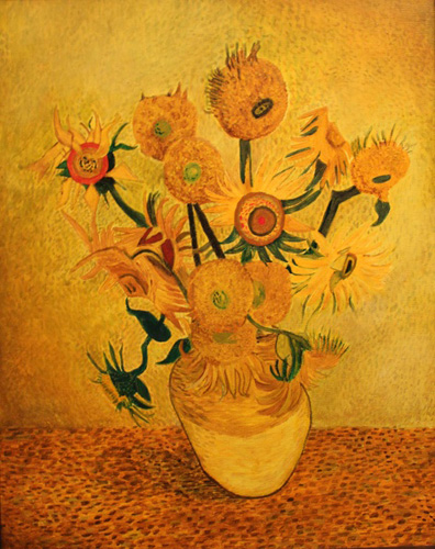
“Sunflowers by Vincent”
- Another quality of paintings from the Italian Renaissance is “Tenebrism.” This involved the dramatic twisting of muscles and clothing. Since I haven’t exactly painted anything like that, I’ll show you this, with hope that you can see the drama such an idea brings to a canvas:
“Splitting”
SECTION FIVE: SUMMARY:
- Subject and Style: 13,000 years ago, humans started making art. But they weren’t making Rembrandts. For that matter, after Rembrandt, it took another 400 years us to forget how smart we were and paint ‘primitive’ again (Picasso). Art came full circle in 13,000 years. And what a journey it was!
“The Eye of Conformity”
Beyond Picasso there was a lot left to learn.
Cubism, Expressionism, Futurism, Dada, Surrealism, Regionalism,
(getting tired of the all the “-isms?” me too!) Abstraction, Action Painting, Pop Art, Minimalism, Photorealism, Graffiti Art, Performance Art, Installation—and AHHH! The Post-Modern…what a relief!
Nothing new to learn, now. It seems everything’s been done, and no stone on this vast beach has been left unturned…
Still, maybe YOU can make something no one has seen before and call it Art. Can you do it? WELL???
Probably not.
But that doesn’t mean you can’t have a lot of fun trying. And you might just make something lasting that you want to hang on the wall of your domicile.
Lasting…and significant. Two of the key qualities of any art.
Valuable…if you like it, it has value. Don’t be shy, stake your claim.
Such are the basic elements of art, as I see them. I sincerely thank you for taking the time to read my opinions on the subject. I hope you paint and be happy in the now and always.
Clayton Schonberger
December, 2018 – June, 2019
For Jon and Billie Jo